
Run Revel Posters
Layout, Typography
I worked for the REVEL Race Series for 4 years. At the end of that time, I wanted to make a series of posters for three of the events. This race series branding leaned into them being outdoor and downhill races. I wanted to change that with this series of posters and lean into them being fast and athletic. I used Brutalist design mixed with Swiss Style Layout to create a more modern feel to this race series
Programs Used


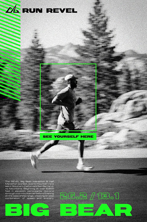
I intentionally wanted to use images showed one runner. In photoshop, I took out all the color, changed the contrast and a motion effect. I wanted these to border on abstract photography.
Each one of these posters, I wanted to contain the name of the race, the text "Run REVEL" and the distances. I also added a box around the runner to highlight the individuality of a race. The campaign was to highlight how you can place yourself into this poster. You don't have to be a world class athlete to run a marathon. You just need discipline in training and perseverance.
In order to make them feel minimalist, I took out most of the color on these images and added one very bright highlight color for other elements.
There was a lot of trial and error to get the contrast right. I also looked through many photos to find the right ones. These final images are several images combined together to create this effect for my design purposes.
This image was the most abstract I used. I really like the Holga Cameras and how they take photos. I made an effect to make it look like it was shot with this style. I added a pop of the pink color which was used in the rest of the design.
I added the zig zag pattern below to make it feel more intersting and a nod to the brutalist style, especailly neo-brutalism which you see a lot right now in design.


Once I found this image, I knew I wanted to use yellow for the highlight color. I could keep some of the yellow color from the original image to bring out the autumn colors of Big Cottonwood Canyon.
I've run this race several times and there's always a pop of fall leaves, mostly yellow from the aspen trees.
I was really happy how this image turned out. It was the perfect level of contrast from white to dark to color. I was able to place my other elements much easier when it came time to integrate them.
